
Agency ReName // ReBrand // ReInvigorate
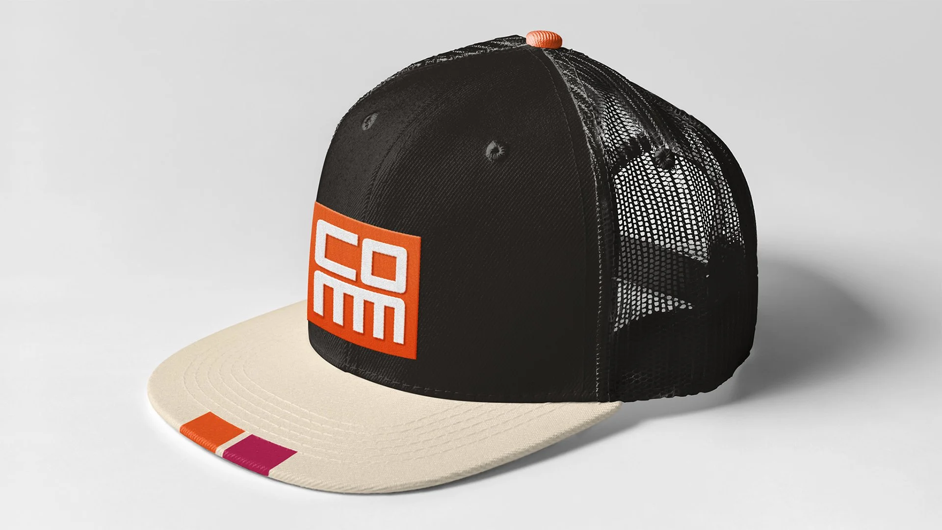
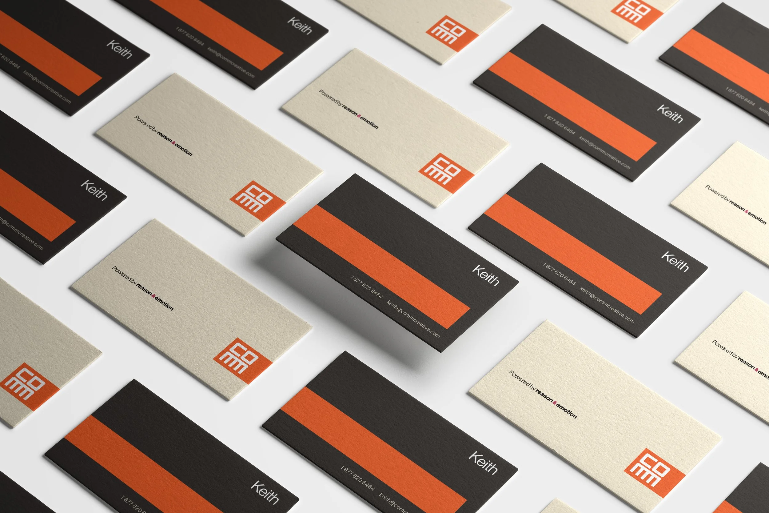
COMM
DIFFERENT
WITH PURPOSE
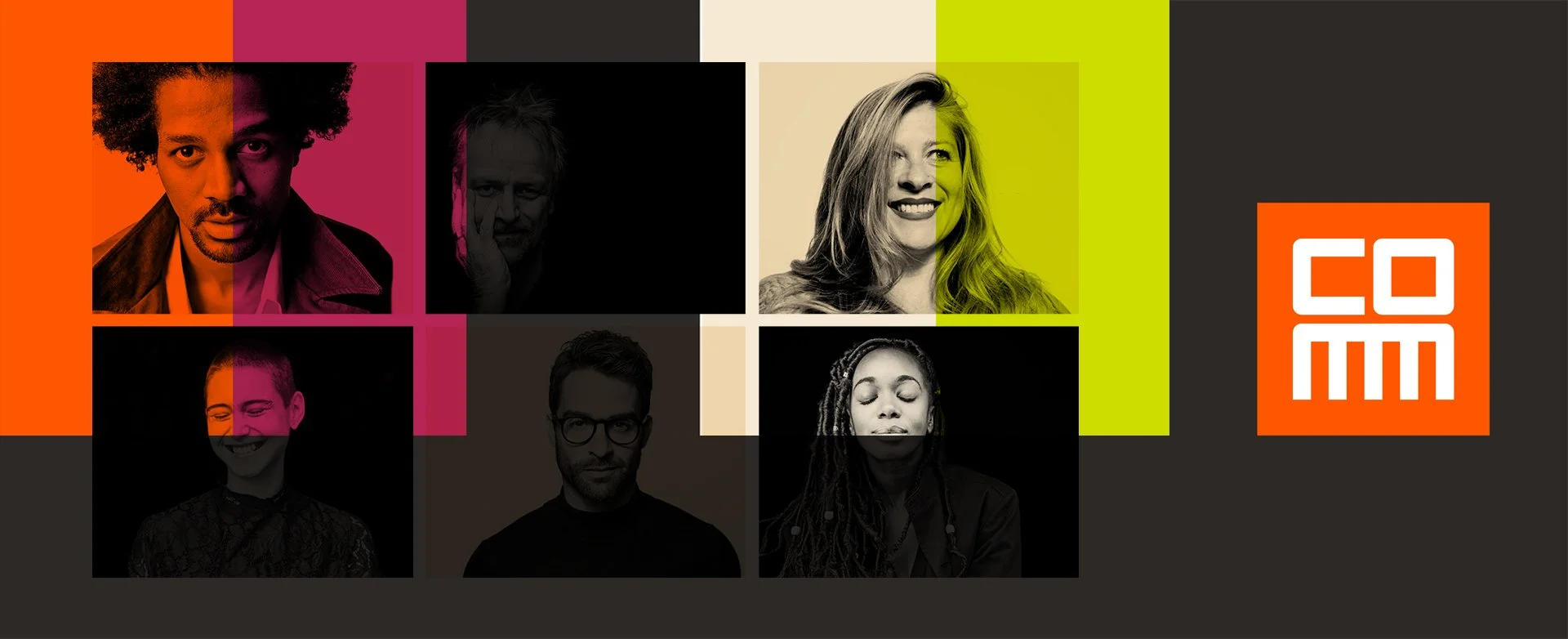
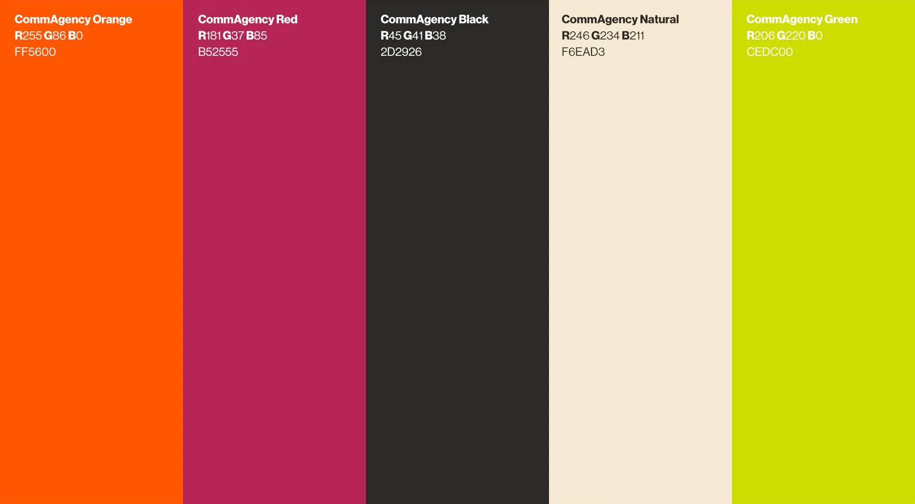
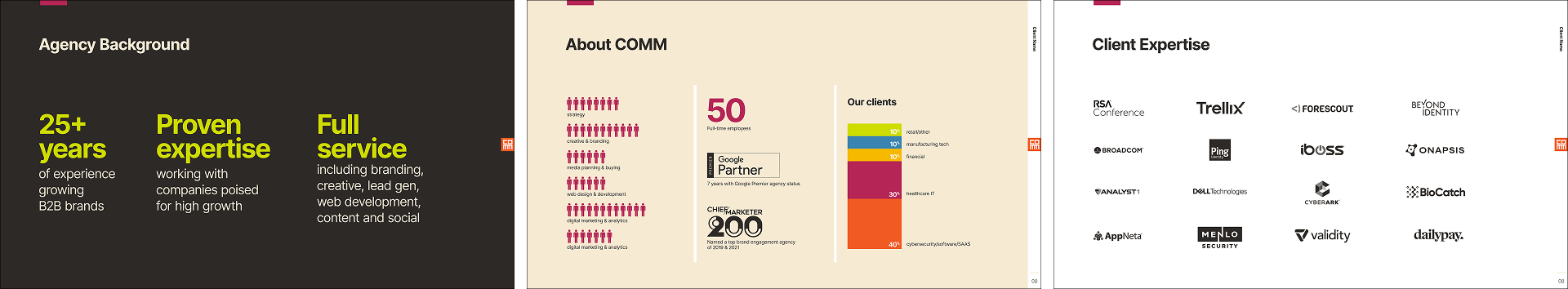
Having recently joined the team and learned the agencies long rich history, I was excited we were asked to create a new visual identity for a 25-year-old organization, historically positioned as a mid-size B2B player with deep understanding of data. Seeing the opportunity to flex, we shortened the name, paid a lot of attention to voice and tone, and grounded the identity in clean, crisp creative choices of purpose and distinction—aligning with our core values while celebrating character.
Previous Wordmark:

Previous Logo:

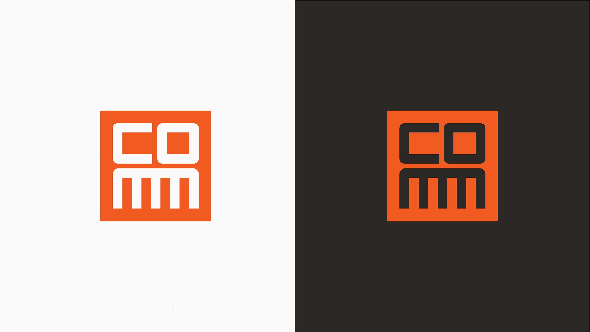
New Name, Wordmark & Logo:


37 Days
So good they couldn’t wait.
We put in a lot of energy to get this identity where it needed to be and successfully launch the brand refresh, then not a minute later COMM was acquired by Marketbridge. Not that the acquisition was all about the rebrand, there was always plenty good under the hood, but we’ll take the complement.